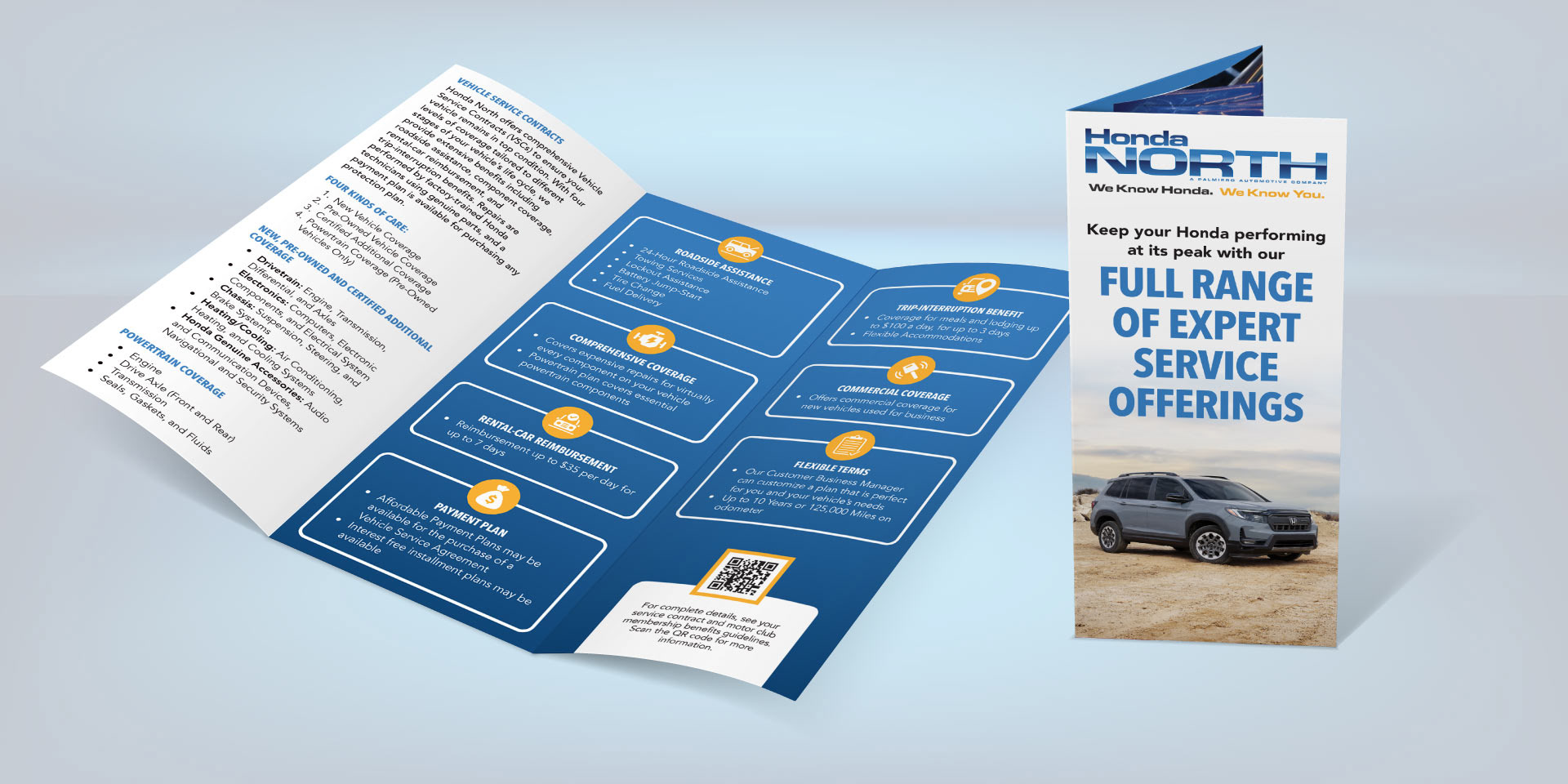
TRIFOLD BROCHURES FOR HONDA NORTH
I designed a pair of brochures for Honda North to help deliver a high volume of important content in a clean, accessible way. Because the client needed to communicate a lot of detail, the design focused on breaking up dense text into manageable, readable sections.
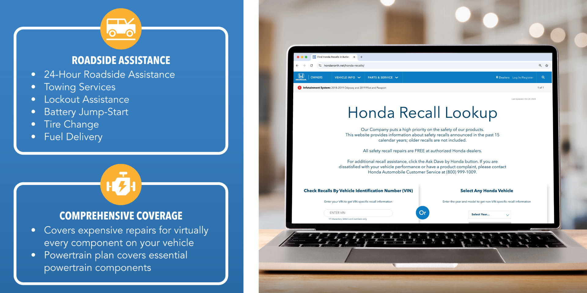
Colors were drawn directly from the Honda North logo: a bold primary blue, an orange accent, and a blue gradient that added depth and a modern feel. Where space for imagery was limited, custom icons were used to add visual interest and make complex information easier to digest. Where space allowed, imagery included Honda vehicles and employees to keep the content on-brand.
QR codes throughout the layout served as strong CTAs, driving readers to explore more online, take the next step, or follow the dealership on social media.