Brochures
Client:
HONDA NORTH
Scope:
TWO TRI-FOLD BROCHURES
Software:
ILLUSTRATOR, PHOTOSHOP
About the Project
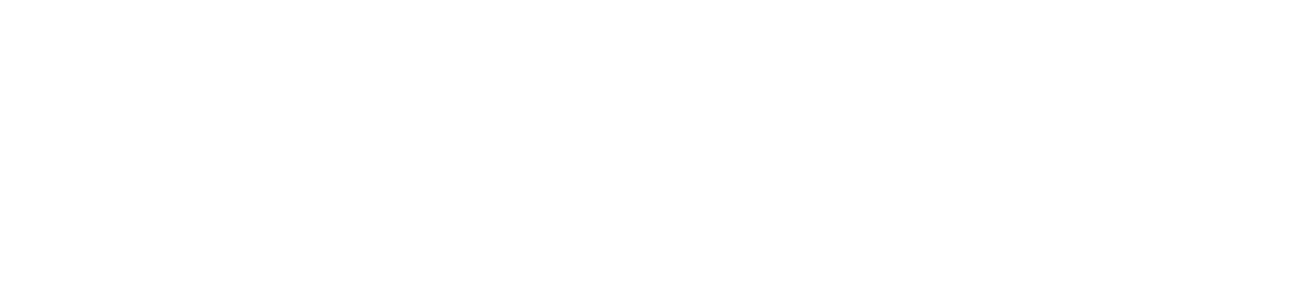
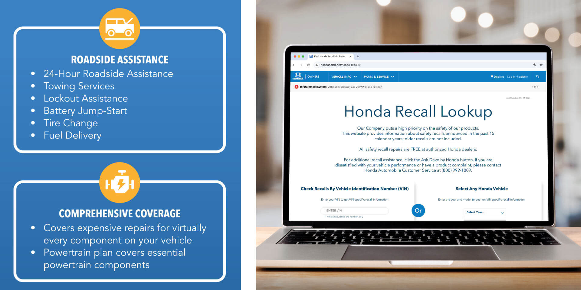
For Honda North, one of my clients at Strong Automotive, I designed a pair of brochures to help communicate a large amount of information in a clean and accessible format. The goal was to organize detailed content in a way that felt clear, readable, and visually engaging.
By breaking up dense text into manageable sections and supporting the content with strong visual elements, the brochures guide readers through key information while maintaining a polished and professional look.

Project Highlights
Layout & Structure
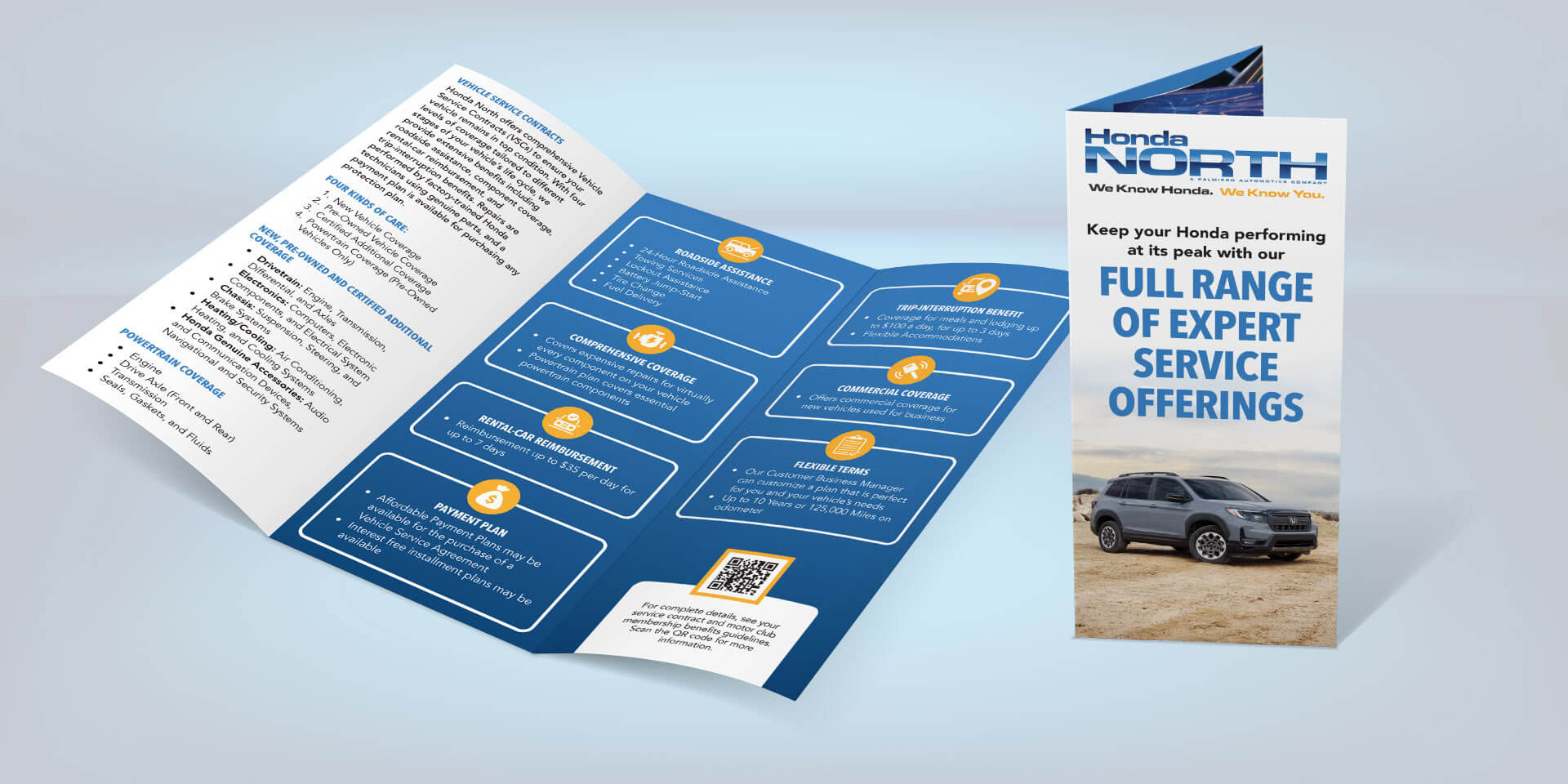
Because the client needed to communicate a high volume of information, the design focused on organizing content into clear sections that are easy to scan and navigate. Thoughtful spacing, hierarchy, and typography help make the material approachable without overwhelming the reader.
Brand Integration
The color palette was drawn directly from the Honda North logo, incorporating a bold primary blue, an orange accent, and a blue gradient to add depth and visual interest. Where space allowed, imagery of Honda vehicles and employees helped reinforce the dealership’s brand.
Visuals
Icons were used throughout the brochures to add visual interest and break up the copy. QR codes also served as strong calls to action, encouraging readers to explore more online, take the next step, or connect with the dealership on social media.
Say Hello
If you’d like to connect or talk about a project, I’d love to hear from you.