A Look at 2025 | Strong Automotive
A Range of Client Work
Over the past four years at Strong Automotive, I’ve worked in a fast-paced environment focused on delivering high-quality graphics. As a team lead for five designers, I’m a part of an Art Department that produces thousands of graphics for dealerships nationwide.
From direct mail to digital, the focus in 2025 stayed consistent: clear communication, strong hierarchy, and design choices that support the client’s message.
Here’s a look at a handful of projects I created in 2025 at Strong Automotive.
Direct Mail
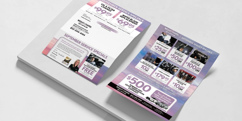
Lexus of Wesley Chapel frequently sends out service-focused trifold mailers. Having worked with this client for years, I leaned into their established visual style, incorporating soft sunset tones to keep the design approachable and friendly. Strong text hierarchy and thoughtful use of color make the information easy to scan, helping customers quickly find the offers most relevant to them.
Logo
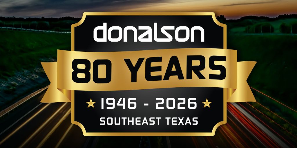
As part of a plan for the upcoming year, I designed an 80-year anniversary logo for Donalson Automotive. Built as a classic badge mark, it uses gold to reflect longevity and prestige, supported by a banner and outlined shape for a timeless feel. Star elements reinforce their reputation for high-quality service, with the design centered on celebrating 80 years in Southeast Texas.
Email Marketing
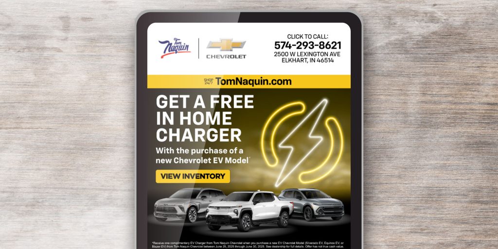
For Tom Naquin Chevrolet’s email campaign, I used a smoky image for visual interest, with a lightning bolt icon representing electric vehicles. Yellow accents tie back to Chevrolet’s branding, keeping the piece bold yet easy to read.
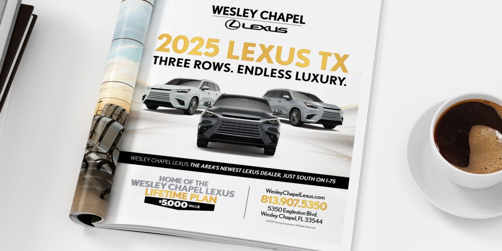
Magazine Ad
Leaning into a more minimal direction, I created a large-format ad for Lexus of Wesley Chapel. A crisp white background creates an open, elevated feel, allowing the content to stand out without unnecessary clutter. Limited use of gold reinforces a premium tone without overpowering the layout.
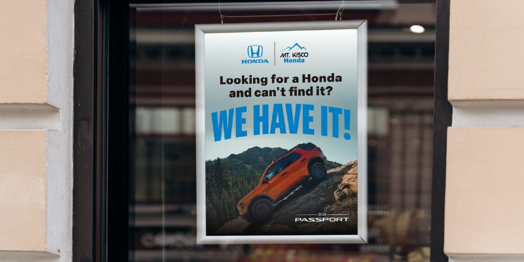
Poster
For Mt. Kisco Honda, I designed a poster built around strong photography provided by Honda. The layout uses the imagery as its foundation, placing typography around the focal point rather than allowing it to compete for attention. The result is simple and direct, letting the visual carry the message.
Across each of these projects, I followed Strong Autmotive’s guidelines for advertising and adapted to the needs of each client and format.
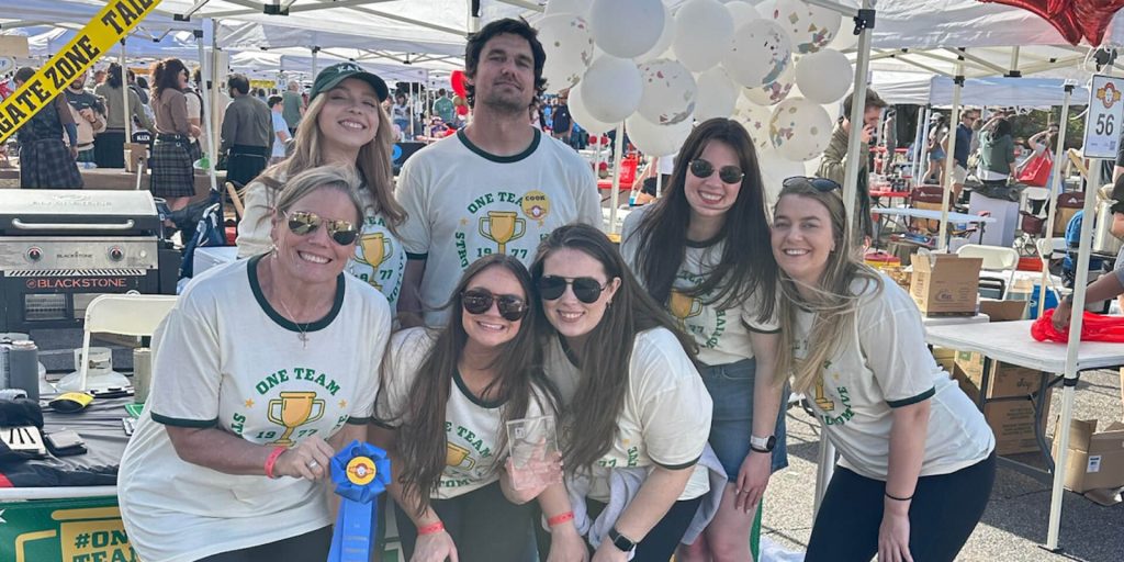
Outside of Client Work
For Strong Automotive’s participation in the Exceptional Foundation Chili Cookoff, I designed a t-shirt and table banner.
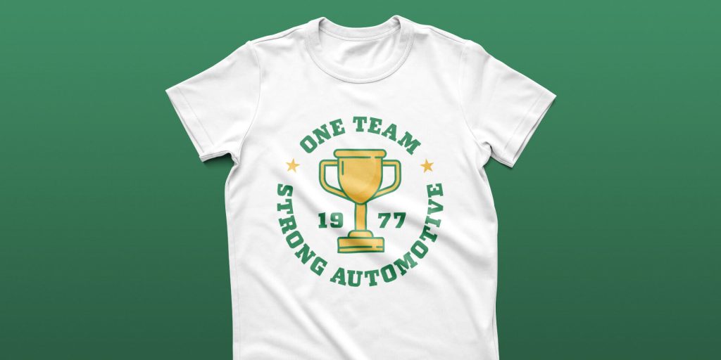
The direction leans into a varsity-inspired, vintage aesthetic. “One Team,” the company’s 2025 theme, appears at the top of the design, separated from “Strong Automotive” by star accents. A trophy sits at the center, with the founding year balanced on either side. An stock trophy illustration was refined to better align with the composition and brand style. Bold typography and bright yellow, paired with Strong Automotive’s signature green, create a bright, energetic feel.
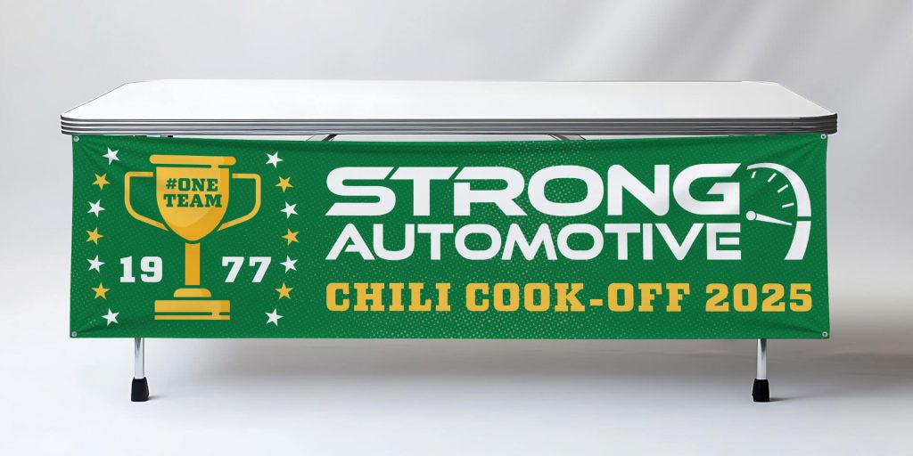
The table banner reworks the design into a larger format, creating a consistent and cohesive presence for the team.
Closing Thoughts
Working in this environment has shaped how I approach design at a high volume. It’s reinforced the importance of clarity, consistency, and efficiency, along with strong attention to spacing, hierarchy, and typography.
Whether part of a larger campaign or a single piece, the goal remains the same: create work that communicates clearly and drives results.