Balancing Detail and Impact
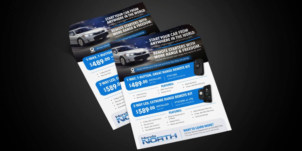
Honda North requested a full-page flyer promoting its remote start systems, and projects like this are always a fun challenge for me. Taking a block of plainly formatted copy and transforming it into something engaging feels a bit like putting together a puzzle, where I’m moving pieces around until everything clicks into place.
At the top, I used a dramatic vehicle image to immediately grab attention and set the tone. From there, two key headlines highlight the biggest benefits of the system, giving viewers a quick understanding of what’s being offered.
The layout then shifts into a more structured section featuring two remote start options and their technical details. With so much information to include, my goal was to keep everything organized, readable, and easy to navigate without making the page feel crowded. Careful spacing, hierarchy, and visual balance help guide the viewer naturally through the content.
The bottom section brings everything together with a clear call to action and contact information, making it easy for interested customers to take the next step.
Projects like this are one of my favorite types of design challenges. I enjoy taking detailed information and turning it into something visually engaging, making sure every element has a purpose and fits seamlessly into the overall layout.