
Making an Impression
Business cards may be small, but they’re often one of the first physical touchpoints someone has with a brand. For Black Creek, they’re especially important, as the team frequently travels to trade shows and industry events where building relationships face-to-face is a key part of the job.
Black Creek’s existing business cards no longer reflected their updated branding, so this project was an opportunity to give them a fresh look. Since blue is such a recognizable part of the brand, I wanted to lean into it rather than default to the standard white business card. The vibrant blue background immediately stands out while reinforcing Black Creek’s visual identity.
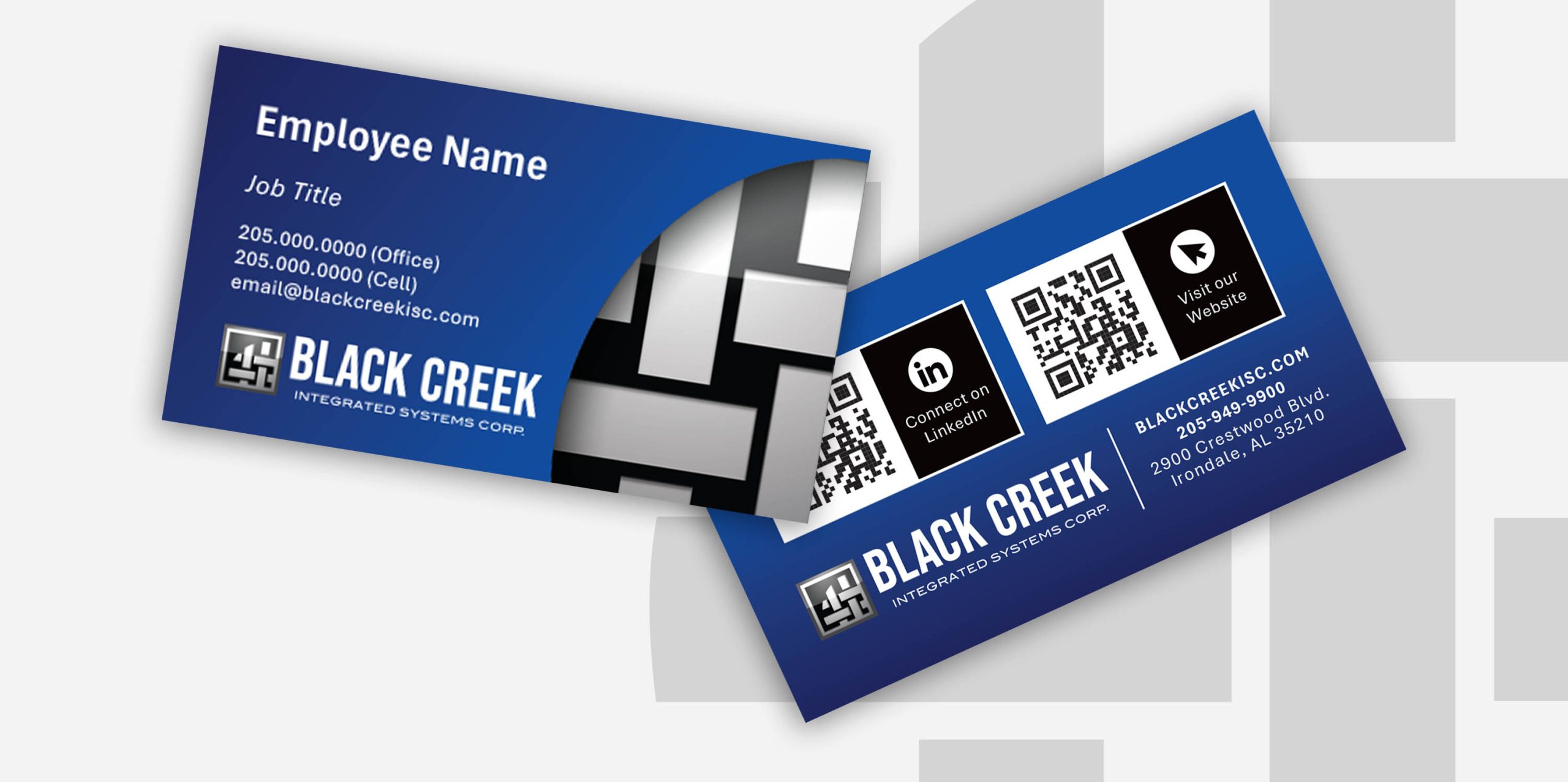
One thing I’ve learned from designing business cards for many Black Creek employees is that there’s always a surprising amount of information that needs to fit into a very small space. Contact details, job titles, branding, website information, and more all need to work together without feeling crowded. The final design also includes QR codes linking directly to the company website and individual LinkedIn profiles, making it easy for someone to connect.
To add a little more visual interest, I incorporated elements of the logo to create a sense of depth. This helps give the card a more polished and intentional feel without distracting from the information itself.
What I like most about the final design is that it feels distinctly Black Creek. It’s modern, recognizable, and practical while giving the brand a stronger presence in a format that’s often overlooked.