Giving a New Showroom Its Own Logo
A Long-Running Freelance Relationship
I’ve been working with Margie, the owner of MB Design & Construction, since 2019. She was one of my first, if not my first, freelance clients. We were connected while I was in college in the graphic design department, and Margie was an interior design professor who needed a website built. That first project turned into a many-year working relationship, and I’m really grateful that it did. Since then, she has reached out whenever her business has a design need. We’ve worked through countless ads together, along with updates and maintenance for her website, so it’s always fun when a new project from her comes my way.
Creating a New Identity for the Showroom
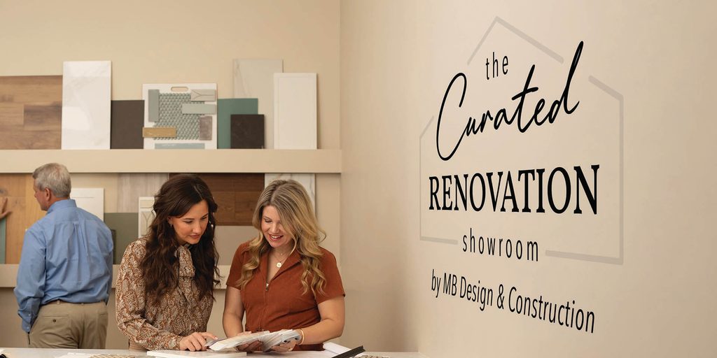
This time, an email landed in my inbox about The Curated Renovation Showroom, a space where clients can look through materials like tile, countertops, flooring, and more while planning their renovations with her team. Because the showroom was getting its own space, Margie wanted a logo to give it an identity of its own while still feeling connected to the existing MB Design & Construction branding.
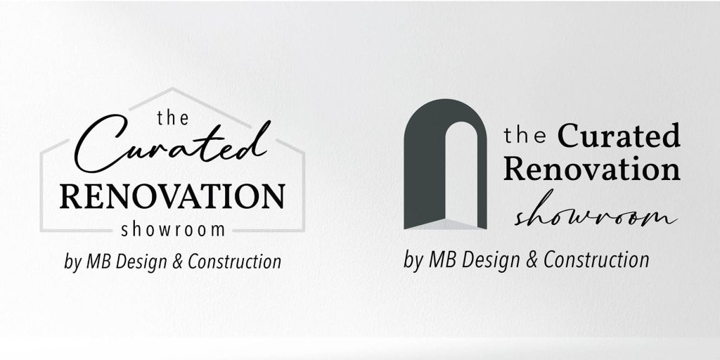
I started with two main logo directions. One stayed pretty close to the existing MB logo with the familiar house-shaped lines and script, and the other went in a new direction while still using fonts that fit her company branding.
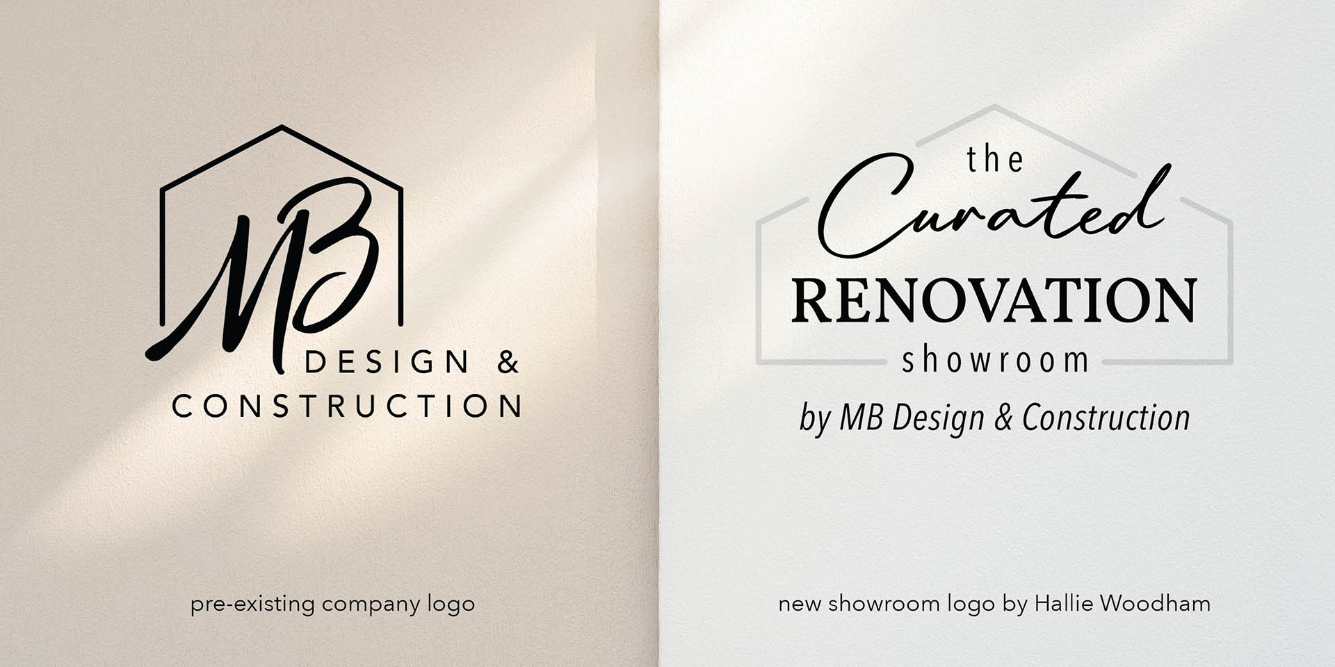
After some feedback from Margie, the final direction started to take shape. She ultimately went with the direction that correlated with the existing logo, but still gave the showroom something of its own.
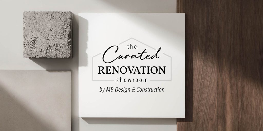
The logo uses a different script for “Curated” to keep things fresh, and uses neutral colored lines instead of black, for a softer look. Because the showroom name was the main focus, I wanted those lines to blend into the background a little more rather than compete with the type.
From Logo to Print
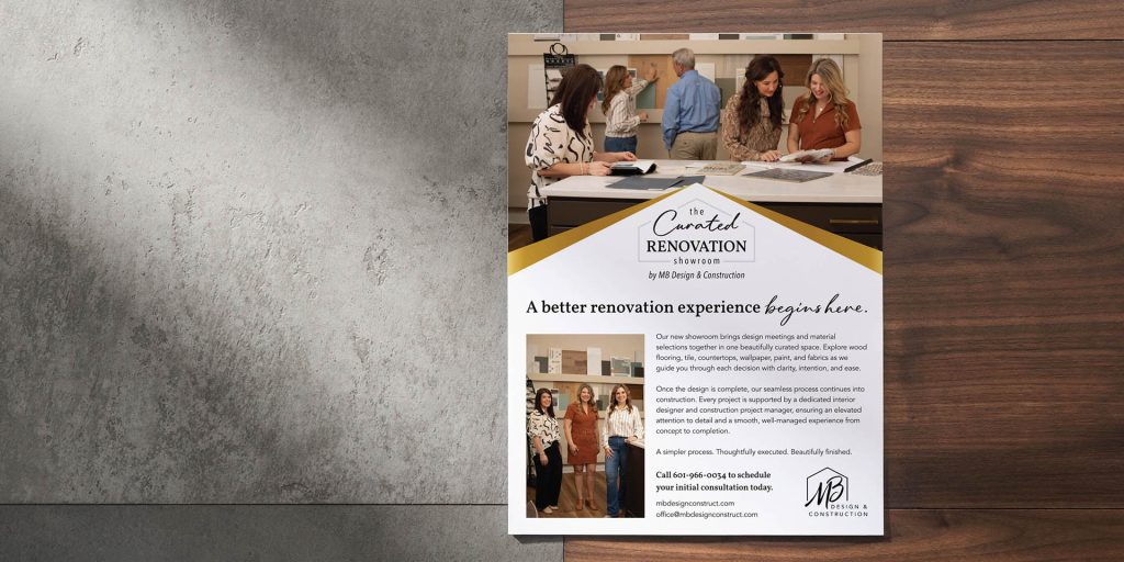
When the logo was finalized, I moved on to the print ads. I created the initial full-page and then adapted it for several local publications, including Stroll, Stages, and Hometown. Each publication had its own size requirements, and what works perfectly in one size doesn’t always work in another, so some versions needed to be rearranged or have information removed to keep everything clear without making the ad feel crowded.
The final quarter-page version for Stroll was one of those adaptations, with the showroom imagery taking up the top portion and the logo and contact information carrying the rest of the ad.
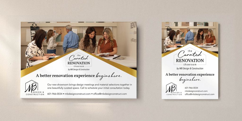
Margie regularly runs ads in these publications, so it’s been fun getting to work on them over the years and seeing how the designs change as her business evolves.
Another Chapter in a Long-Running Project
I love getting to work on branding, but there’s also something special about getting a project from someone I’ve worked with since college. Graphic design and interior design are obviously very different, but Margie knows what works for her business and has always been a pleasure to work with.
One of my favorite things about freelance work is that sometimes a project starts with one very specific need and turns into a working relationship that lasts for years. This showroom logo was just the latest chapter, and I’m always looking forward to see what the next email will bring.